Sunday, September 23, 2012

Summer Quarter 2012: Drawing and Anatomy: Figure Studies/Dustin

Gestural study:
Vine charcoal on newsprint


Gestural study:
Vine charcoal on newsprint


 Gestural study:
Vine charcoal on newsprint


Gestural study:
Vine charcoal on newsprint


Gestural study:
Vine charcoal on newsprint


 Gestural study:
Ball-point pen on newsprint


Gestural study:
Ball-point pen on newsprint


Gestural study:
Ball-point pen on newsprint


Gestural study:
Vine charcoal on newsprint


Gestural study:
Vine charcoal on newsprint


Gestural study:
Vine charcoal on newsprint


Gestural study:
Vine charcoal on newsprint


Gestural study:
Vine charcoal on nesprint


Dustin seated 1:
Vine charcoal and black conte on drawing paper


Dustin seated 2:
Vine charcoal and black conte on drawing paper


Dustin seated 3:
Vine charcoal and black conte on drawing paper

Summer Quarter 2012: Drawing and Anatomy: Figure Studies/Rebekka

Gestural studies:
Ball-point pen on newsprint


Gestural studies:
Ball-point pen on newsprint


Gestural studies:
Ball-point pen on newsprint


Rebekka Seated:
Ebony Pencil on drawing paper

Summer Quarter 2012: Drawing & Anatomy: Bone and Muscle Studies

 Detail of Head of Femur:
Ebony pencil on drawing paper


Bones, Muscles and Tendons of the Hand:
Ebony pencil on drawing paper


 Master Reproduction (I believe this was based on Davinci):
Vine Charcoal and Black Conte on drawing paper


 Detail of Femur and Pelvis:
Ebony pencil on drawing paper


Pelvis and Femur study:
Ebony pencil on drawing paper


Rib and Vertebrae study:
Ebony pencil on drawing paper


Skull Study:
Black and White Conte on Gray Mid-tone paper


Upper Arm Muscle and Bone study:
Ebony pencil on drawing paper


Bones of Foot study:
Ebony pencil on drawing paper


Muscles and Tendons of Foot study:
Ebony pencil on drawing paper


Torso study:
Ebony pencil on drawing paper

Back of upper leg study:
Ebony pencil on drawing paper


Shoulder joint and clavicle study:
Ebony pencil on drawing paper


Knee joint study:
Ebony pencil on drawing paper


Lower Leg bone study:
Ebony pencil on drawing paper


Front lower leg muscle study:
Ebony pencil on drawing paper


Back lower leg muscle study:
Ebony pencil on drawing paper


Back muscle study:
Ebony pencil on drawing paper


Scapula study:
Ebony pencil on drawing paper


 Front upper leg study:
Ebony pencil on drawing paper

Friday, July 6, 2012

Spring 2012 Illustrator Final: Book Cover

Final Project:  Book Cover recreation, King & King
For the final in our Illustrator class we had to re-imagine an existing book cover.  I chose the children's book, King & King by Linda De Haan and Stern Nijland.  I printed the final image and wrapped the actual book for the final.  All artwork and text is vectored.  I drew the two Kings after comic artists Darwyn Cooke's Hal Jordan from New Frontier and Ben Caldwell's Steve Trevor sketches, but I omitted the women the guys were kissing.  Throw in the crowns and hearts and I think you have a cover befitting the controversy the book has received.  The book itself is very sweetly written and illustrated in multi-media collage.  The last page has the two Prince's kissing as they become King and King, but their lips are covered by a heart.  It's all innocently enough presented, but it has caused an uproar in some circles and I wanted to put this on the cover, only more explicitly.  I also chose the rumpled paper texture as a nod to the book being a heavy topic for some, it's on the banned books list after all. 

Sunday, June 17, 2012

Spring Quarter 2012 Digital Illustration

The quarter finally wrapped up this past week.  The following are my major projects from Digital Illustration.  The course focused on using Adobe Illustrator to create vectored artwork. 

 Project 1:  Graphic T-Shirt design
For this project we had to design a t-shirt.  It could be any theme or subject matter.  I like and own quite a few t-shirts of cartoons and such from the 80's and Mother Brain is one of my favorite characters so it made sense for me bot incorporate her into the design.  I copied this after promotional artwork released back in the day for Mother Brain for the Captain N cartoon. The image was hand drawn and scanned, then vectored in Illustrator.  I left the sketchy elements after a critique but was originally going for a more symmetrical framework with her tentacles.


Mid-Term Project:  Propaganda Poster
We were tasked with making a World War II inspired propaganda poster.  I went fairly literal to the task, as we didn't have to remain specific to WWII and could have chosen any subject matter.  Wonder Woman is hand drawn after a pin-up originally by Darwyn Cooke.  The illustration was scanned and vectored in Illustrator and text and effects added to finish it out.

Thursday, May 17, 2012

Spring 2012 Quarter

Art History II

In this class we had a project due at the end of the week where we had to produce art as part of the historical study.  You had to take inspiration from an artist or art style that was presented that week in the reading.  I took this class online so it was presented in a condensed format of 5.5 weeks.  So there were only four artworks produced.

Project 1:  Work inspired by Monet
Monet’s work really captured my attention this week, so I rendered a painting mindful of the Impressionists use of sketchy brush strokes and lighting effects.  These same aspects of Impressionism guided my choice of artwork, as it’s a way of making art in which I have the least experience.  I was amazed at the lengths Monet gave the study of local color.  I painted this outside just before sunset.  The medium is acrylic paint on canvas.  The process really emphasized the time constraints Impressionists worked in as lighting changes fairly quickly and then your reference material looks completely different.  In trying to capture the moment, I did get a better understanding of the sketchy nature of the style.

 Project 2:  Work inspired by Symbolism
Symbolism, specifically the work of Gustave Moreau inspired my studio assignment this week.  Symbolism appeals to me largely due to the theme of presenting mythological and fantasy type settings.  The style is part idealized form, legendary story and dreamscape all smashed up into one work.
  
For this work I chose the myth of Apollo and Hyacinthus.  The story is of Apollo and prince Hyacinthus falling in love and living happily in each other’s company.  The god of the west wind, Zephyrus, had also fallen for Hyacinthus and was scorned when the prince chose Apollo.  While Apollo and Hyacinthus played at discus throwing one day, Hyacinthus decide to run and catch the discus to impress his lover, but the bitter Zephyrus blew Apollo’s discus off course and it struck and killed Hyacinthus.  Apollo tried to stop the bleeding but he could not save his life.  Apollo in his grief refused to let Hades take the prince and instead created a flower from his blood after his namesake.  
 
 
 The medium of choice for this is vine charcoal on drawing paper.  I also used a small amount of compressed for the shadows under the figures.  I chose to use charcoal as I feel it has that hazy dream-like quality.  I took inspiration from various paintings for the posing and did a 2-up reproduction of sorts to merge the inspiration into on composition.  Hyacinthus was copied from the pose in The death of Abel (1791) by Francois-Xavier Fabre.  I used the Parthenon as reference for the temple in the background and opted for the broken depiction of the temple to echo the lack of power Apollo had as a divine entity to bring Hyacinthus back to life.  I made the sky darker to denote Apollo’s sadness since he’s associated with the sun.


 Work 3:  Inspired by Futurism
Futurism, specifically the work of Giacomo Balla inspired my studio assignment this week.  Futurism was the most appealing topic to me as it was extremely motion driven art before the advent of motion pictures and traditional animation.  Balla’s paintings, from Dynamism of a Dog on a Leash (1912, Oil on canvas) to his presentation of the Futurists ideal concept of beauty in movement of the automobile, he captured motion and light in ways that are more true to art than the marvels of modern movies.  To me his work is animation at its finer form.
 For this work I chose to experiment in photography.  I took photos of my hand in front of a door while waiving.  I like the play of shadows and after image and count the repetition of the fingers as a modern attempt at Futurism.  I had originally thought a more blurred open aperture would have been more appropriate but ultimately decided the repeating imagery was more in line with the art style.
Work 4:  Inspired by Abstraction (Photography and Georgia O'Keeffe)
The inspiration for my studio work this week comes from a combination of  the paintings of Georgia O’Keeffe and the photography of Edward Weston.  The abstract close-up both artists used really resonated with me in the use of a simplified portion of something to make a larger artistic statement.  I started with a close up photo of an action figure on the shelf in my art room/office at home, then cropped it in a little closer and applied a dry brush filter to give it a painted look.  The angled lines create a nice sense of motion and the close-up is at a degree that I think you don’t really notice what the subject matter is and instead can appreciate the artistry of the abstract design it creates with the form and the shadow on the wall behind it.

Saturday, March 24, 2012

Winter Quarter 2012: Image Manipulation

This class was all about using photoshop to make collage, improve images and occasionally mashing up unrelated images into a hopefully seamless work of art. Photoshop CS5 is the tool used for all the images that follow. The design work presented is my original work in regard to arrangement and layout. The source images however belong to their respective owners. No copyright infringement is intended and if the owner recognizes their work as part of my collages then please contact me if you would like it taken down and I will do so. That said, I will try to site all source material to give credit to the original artists from whom I appropriated the images via web image searches. All images were made in print form from the Photoshop files. Sizes and mounting vary and will be noted in the description of each piece.

Project 1: 5 image collage
For the first project we had to choose at least five images, either appropriated from an image search or original content and make a collage. Any subject matter was allowed but you had to demonstrate the theme of your choice in your image. The theme for this piece was based on natural radiance and rebirth. The only credited piece I know of is the center image from the game art of Castlevania: Lords of Shadows. It depicts a scene showing Pan, the ancient god from mythology. The other images used to construct the scene were of the sun rising over the earth as seen from space, a sunset sky and various photos of dandelions in their puffball form. 8x10 image printed on Kodak Gloss photopaper.


Project 2: Album Cover
This project built on the last, but this collage was to portray the album cover for a fictitious band. The only requirement was that the imagery fit the genre of music and be appealing to the intended audience. Of all the album covers I've seen, Heavy Metal bands usually have the best and most epic artwork, so that is the genre I chose. I heard Space Lord by Monster Magnet on the radio driving home from work and it cemented the idea. So, I came up with the name of my band and their self-titled debut album, Skullfucker Apocolypse. I did the Skullfucker logo by hand and scanned it to edit and color in Photoshop. The text for Apocolypse was made completely in Photoshop. The remaining images were appropriated through a Google search. The Parental Advisory label and background belong to their respective owners. The image in the foreground is from a depiction of the video game villain, Mother Brain. The background is one of H.R. Geiger's pieces. 8x10 image printed on Kodak Gloss photopaper.


Project 3: Midterm Triptych
We had two weeks to work on the triptych for the midterm. I envisioned this piece as a human classical statue gallery, however could not find enough variety in nudes that would fit the classical style. I ended up flanking a male nude photo in classical pose with photos of two classical statues. To me it emphasizes the whole art imitates life imitates art cycle. The title for the project was "Man Made" since artwork is made by man and also and as men we are what we make of ourselves. The art nouveau framework was done hand and scanned. I then used a clipping mask to place a rust pattern from an image search onto the template. Each image is a 13x19 print on EPSON Exhibition Fiber photopaper mounted on black matboard with one inch border.
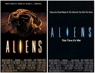

Project 4: Movie Poster
For this project we had to re-imagine the poster for one of our favorite movies. I chose Aliens and the above image is my interpretation (l) next to the original poster (r). Each image is 8x10. Left image is printed on EPSON Luster photopaper, and the Right image is printed on Kodak Gloss photopaper.


Extra Credit Project: Movie Poster
I'm a huge fan of the Barsoom series by Edgar Rice Burroughs. I have the books, the comics, and even own a copy of the HORRIBLE Syfy channel movie with Antonio Sabato Jr. and Traci Lords. So it's a no brainer I'd be excited about the new film. I really loved the movie even if it deviated from the source material a little. It was lots of fun to watch and everyone in the theater cheered and gave applause at the end. It's sad that Disney deems it a loss to their finances. I was hoping for a sequel. Here's hoping. Anyhow, continuing in the movie poster theme, I reimagined the poster. My version is on the left and the original is on the right. I kept most of the imagery in line with the publicity photos released by Disney, but added a painting by Joe Jusko in the background. I found it strange that the story based on "A Princess of Mars" didn't feature Dejah Thoris more prominently. Lynn Collins is a beautiful woman but I wanted a more traditional rendition of the Martian princess for the artwork. Each image is 8x10 printed on EPSON Luster photopaper mounted on Red mat board with a two inch border.


Extra Credit: Preview of FINAL
At this point we were to start thinking of our final project and what it would be. I'm a big fan of He-Man and used to watch the cartoon religiously when I was a kid...and still do today on DVD. :) I always thought of He-Man in being more barbaric a story than what you got in the cartoons, so I started this piece to show how I envisioned the world of He-Man. Credit to one of my artist idols, Earl Norem, and also to the concept painting of Tim Hildebrandt for the source material of this piece. The lightning effect is a manipulated image of electricity from an image search. Printed as 8x10 on EPSON Luster photopaper and also as a 22x30 Stonehenge fine art paper poster print to present with the final.


Pop-Quiz
This image was created for a pop quiz in class. We had to construct an image out of images in a shared folder that were provided by the instructor. Four source images and a text layer were used to make this piece. Photos of an old man's profile, a close-up of mineral water, a sculpture, a bird and a robotic head were the source images. (no print but sized at 8x10)


Extra Credit: Male Nude
I went back to the source image for one of the Midterm prints to rework it as a stand alone piece. The original work by the photographer is on the left, and my depiction is on the right. I played around with the colors a lot on the figure to give him a more healthy flesh tone and set him in a desert/sci-fi setting inspired by the John Carter movie and my love of the Barsoom series. Two images of the moon, the Utah desert, and the male nude were used to make this piece. Both prints 13x19 on EPSON Exhibition Fiber photopaper.


Extra Credit: Pulp Novel Cover Conan Poster
For this work, I reworked an Earl Norem painting from the cover of an issue of The Savage Sword of Conan. For this work, the object was to create a poster of how an anthology or omnibus for the Conan books may have appeared in the 1970's. The original scan of the comic is in the middle and is flanked by two renditions I came up with. I used text from a different comic scan because I liked the worn look it gave the text. I constructed Conan's right lower leg and boot from another scan that I grafted onto the figure and modified to fit the image. 22x30 poster prints on Stonehenge fine art paper.


FINAL: He-Man
Earl Norem is a big inspiration for my love of Masters of the Universe. For my final I chose to continue the rework of the iconic He-Man pose from the earlier extra credit image. Except for the Tim Hildebrandt painting I used as the setting, the remaining elements are all from paintings by Earl Norem. I used the figure from one painting and the lightning and sky from another, then blended the sky into the Hildebrandt painting. It is nice to have an image of He-man tuned to how I envision him. It's a more Conan-esque take on He-Man and the sword has lightning instead of sparkly energy. I took the castle away from the image and lowered the sky to give more prominence to He-Man and also re-sized and re-arranged the skulls to give better direction to him as the focus of the piece. All images are 22x30 poster prints on Stonehenge fine art paper.