
Project 1: Color Wheel Reproduction
Objective: reproduce a color wheel in the shape of your favorite animal. I opted for a more pre-school version of a whale since the Humpback Whale looked a little funny for the project. Cut-out 5"x5" acrylic on 100lb bristol board arranged as color wheel.
Objective: reproduce a color wheel in the shape of your favorite animal. I opted for a more pre-school version of a whale since the Humpback Whale looked a little funny for the project. Cut-out 5"x5" acrylic on 100lb bristol board arranged as color wheel.
 Photography Assignment: Create a composition of items found in nature. Approach composition as a painting assignment, and arrange the natural objects in a design for your photograph. Photo composition of tree root, river stones, acorns and leaves.
Project: Depth
Objective: create a design that shows depth by overlapping, changing saturation and size, and create points of emphasis using color. I used a primary color triad for the color scheme. For this project I envisioned drinking water from the vantage point of inside the esophagus. I reason the water to get lighter in color the closer it is to the viewer and the throat would be darker. 8.5"x14" with 1" inset border, acrylic on 100lb bristol board.
Objective: create a design that shows depth by overlapping, changing saturation and size, and create points of emphasis using color. I used a primary color triad for the color scheme. For this project I envisioned drinking water from the vantage point of inside the esophagus. I reason the water to get lighter in color the closer it is to the viewer and the throat would be darker. 8.5"x14" with 1" inset border, acrylic on 100lb bristol board.
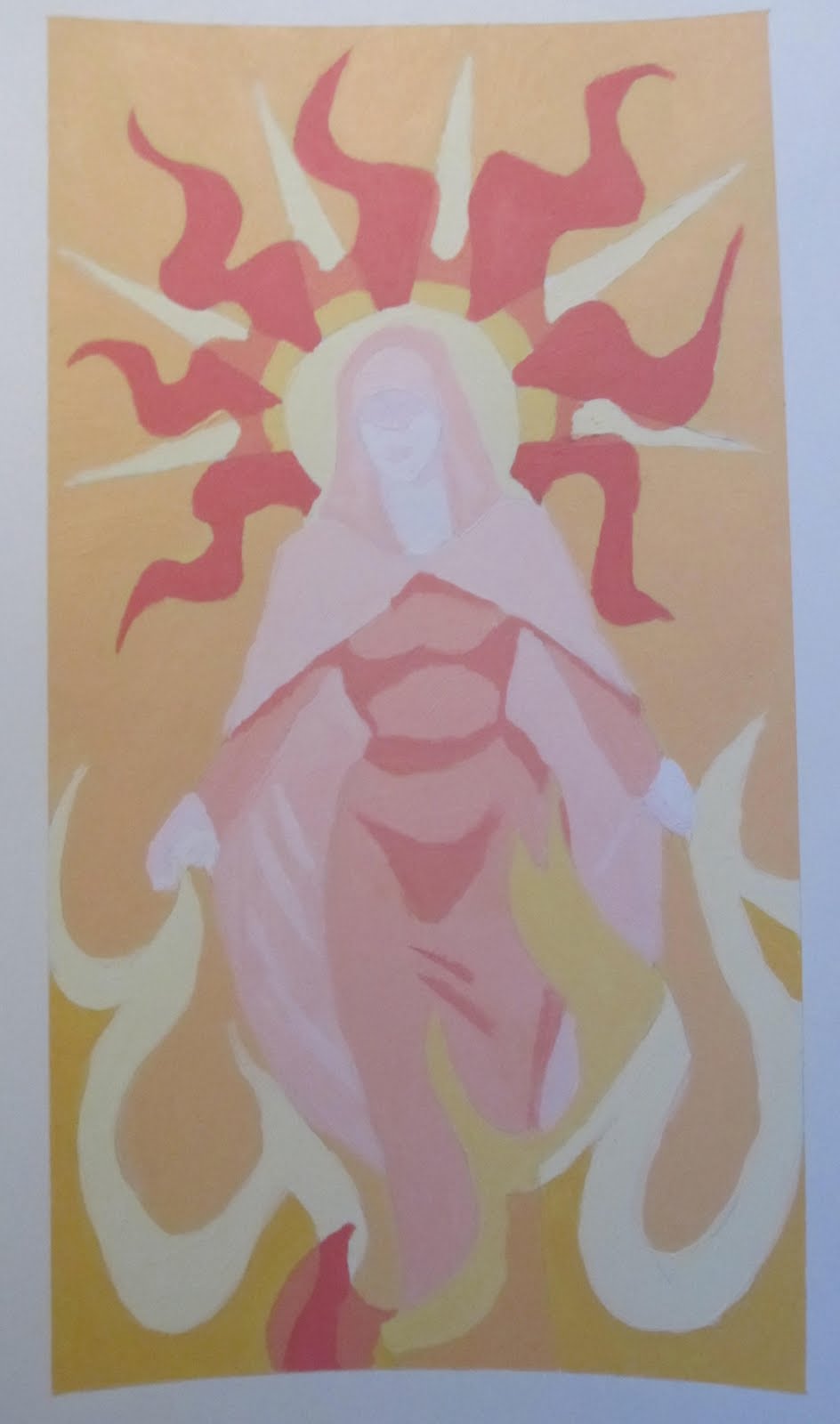
Project: Final (diptych part 1)
Objective: to create two paintings showing opposites based on adjectives of your choosing. This is based on the adjectives Pure and Hot. I used an analogous color scheme for the image. For purity I always think of the religious figure Mary, mother of Christ. The challenge was to portray her image as hot temperature-wise without it appearing too hellish and coming off as an act of sacrilege. I went with the more luminous warm colors in their lighter tints in most cases to show a warm side of the color wheel and still give the painting a more luminous feel.
Objective: to create two paintings showing opposites based on adjectives of your choosing. This is based on the adjectives Pure and Hot. I used an analogous color scheme for the image. For purity I always think of the religious figure Mary, mother of Christ. The challenge was to portray her image as hot temperature-wise without it appearing too hellish and coming off as an act of sacrilege. I went with the more luminous warm colors in their lighter tints in most cases to show a warm side of the color wheel and still give the painting a more luminous feel.

Project: Final (diptych part 2)
Objective: to create two paintings showing opposites based on adjectives of your choosing. This is based on the adjectives Cold and Corrupt. I used a monochromatic color scheme for the image. For corruption I tend to think of the government, as it seems no matter what the party affiliation, our elected officials are out to be more career politicians instead of serving the public. The challenge was easy to come by as far as color choice. I went with the more icy shades of blue to show a cool side of the color wheel to give the painting a frigid feeling.
Objective: to create two paintings showing opposites based on adjectives of your choosing. This is based on the adjectives Cold and Corrupt. I used a monochromatic color scheme for the image. For corruption I tend to think of the government, as it seems no matter what the party affiliation, our elected officials are out to be more career politicians instead of serving the public. The challenge was easy to come by as far as color choice. I went with the more icy shades of blue to show a cool side of the color wheel to give the painting a frigid feeling.
No comments:
Post a Comment